
Gravitational Attraction
What would happen if two people out in space a few meters apart, abandoned by their spacecraft, decided to wait until gravity pulled them together? My initial thought was that …
Joan Roughgarden in Beyond Belief made a very astute observation of a problem, and then proposed a lousy solution to it. The problem she was addressing had to do with the public perception of evolution as something quite uncertain scientifically (“theory vs fact”). She observed that the public sees science changing its stance on many things, especially in medicine. One day, you should eat bran. The next, bran is bad for you. The next, bran is good for you again. As a result the public observes that some sciences are uncertain, and can’t distinguish one field from another or one type of claim from another, so they apply doubt to all of science even when it is not warranted by the science. Her solution involves using religious analogies, interpreting phrases in the Bible to explain things like natural selection and mutations, in order to communicate it to a group of people who share and value that vocabulary. Dawkins rightly chews her out for this approach, pointing out how far she is stretching the meaning of the phrases just to fit her philosophy.
The problem she is stating, however, is quite real. How can we expect the public to make decisions about medicine, global warming, evolution, the big bang, etc... when they (somewhat rightly, somewhat wrongly) observe that the scientists themselves are arguing about it? The Intelligent Design folks are currently using this observation to sow doubt with the public in their efforts to “teach the controversy” of evolution to inject creationism into the schools. It is a failure of the scientists, and the media that covers them, to communicate with the public. Can we do better?
I have a proposal, which I’ll sketch out in a toy example. The problem is not the communication of facts, or even of the procedures of science. The problem is with the communication of uncertainties. In day to day life, we easily handle claims with different levels of uncertainties. The sun rises in the east each morning has low uncertainty. The claims of the auto salesman or the politician have higher uncertainty. Quantifying it is, of course, more challenging but the qualitative features of uncertainty are known to nearly everyone. So scientists and journalists really need to take efforts to communicate the uncertainty of every claim, not just the fact of the claim or how the new observations differ from the old observations. How could this be done? I think, at least roughly, one should include a plot of the probability distribution with any claim. One doesn’t need to know advanced math to see the picture. If every claim is accompanied by a plot of the uncertainties, the public will get used to reading them. Let me demonstrate with a toy example.
Say, I am trying to determine the origin year of homo sapiens. I realize there isn’t just one year, and there is a process, but it is not much harder to include those in this simple analysis. I have several homo sapiens fossils where I’ve measured the age, which allows me to calculate my best guess of the age, and the distribution of my uncertainty shown here.
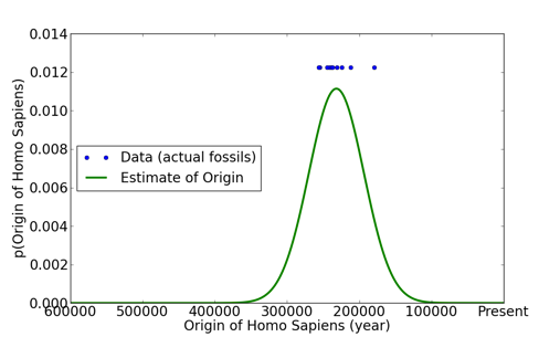
I’ve used a normal, Gaussian, distribution here although in fact it probably should be something skewed left and probably a lot flatter to reflect our greater uncertainty with age, and that we have other observations that put confident lower limits on the origin of homo sapiens. Again, the details aren’t important because all attempts at clarifying the distribution only further help with communicating the uncertainty to the public. A few observations are in order here:
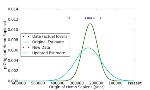
Now, we have a new paper that adds another fossil much older than than the previous ones, around 340000 years ago. Newspapers may claim “origin of homo sapiens 150% older than originally thought”, or “estimates of the origin of humans overthrown by new data”. How might it look with the uncertainties plotted?
There are a number of lessons that can be read from this.
In reality, estimating an origin (first event) will update a bit differently than this example shows. For example, the uncertainties in the right-half of the distribution may not be affected at all by an older observation. If this data were in medicine, however, and we were estimating the effect of some new treatment, then the update would be very similar. A single result of a strong effect may not increase our best estimate for that effect by a huge amount. The uncertainties in many medical treatments, or dietary recommendations, straddle the origin: there is significant probability for no effect. It would be fruitful to see the plot of uncertainties, pushed a little this way and that, updated in perhaps a wiki style by scientists as new data come in. There would be many lessons, all of which would help the public understanding of science.
I think the public could learn to, at least qualitatively, understand and use plots like these. Perhaps there is a better way to display it that does not do violence to the truth, and I’d be open to that. I think getting in the habit of making plots like this would be good for the scientist as well, forcing them to address and communicate the actual uncertainties in their claims.
Gravitational Attraction
What would happen if two people out in space a few meters apart, abandoned by their spacecraft, decided to wait until gravity pulled them together? My initial thought was that …

A Simple Physics Problem Gets Messy
A physics problem from a practice AP test came to my attention, when my daughter was in AP physics this past spring. I went over her solutions when she did …

Skepticism and Dubious Medical Procedures
In my discussion with Jonathan McLatchie on the Still Unbelievable podcast, I said that there hasn’t been a verified miracle claim even since Hume’s essay on miracles. Here I look into the papers he references in response.
What problems are you interested in? How can I help?